Information architecture & UI · Travel concept
Fly.way
Location, price, and reviews before booking.
Explore prototype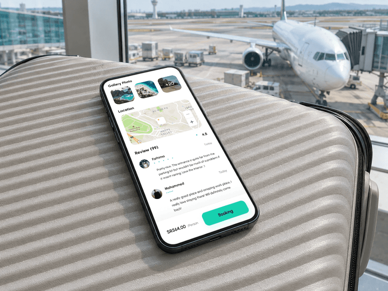
Travel and booking concept · Figma
My roleContent organization, interface design, and the booking flow.
Fly.way’s design challenge is the transition from exploring a destination to booking it. How can travelers review the place and cost, then enter their details without every decision competing on one screen? I focused on information architecture and the booking sequence.
The decisions behind the screens
Bring destination details together.
The place page groups its description, photos, map, and reviews with a per-person price and booking action. Travelers can review these details before moving on to their booking information.
Separate booking decisions into stages.
The interface shows three stages: time and date, details, and payment. This separates choosing a trip from entering booking information, while the progress indicator shows the current stage and what remains.
Place the cost beside the next action.
On the date-selection screen, the total sits beside the next-step button. This puts the cost at the transition point, where travelers can review it before continuing.
What I took forward
The deliverable is a prototype connecting destination discovery to booking stages. A next usability test would check whether travelers can identify the trip cost and choose a date without going back to find missing information.